Using Pareto Principle Psychology to improve your User Experience


Have you ever noticed how you use the same small number of features in your favourite software? It’s capable of hundreds of functions, but have you ever actually used them all? How about your favourite website… do you look at every single page or do you generally just look at a small number of pages that most interest you? Do you use all the functionality on that page or do you just press the occasional ‘Like’ button?
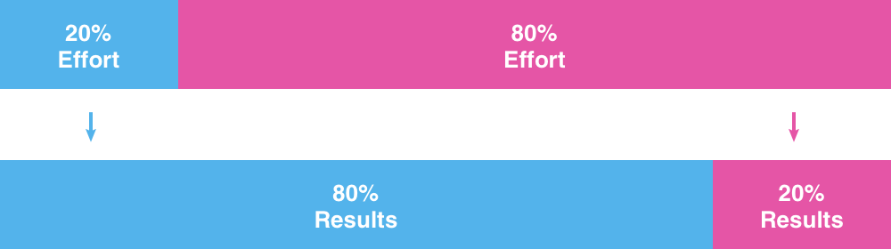
80/20 rule
This is the norm. You’ve probably heard of the 80/20 rule; we tend to use 20% of things 80% of the time. The principle is also used to mean that 20% of the effort will generate 80% of the results. It’s often the case that 20% of customers generate 80% or more of revenue for a company. It’s known as the Pareto Principle and it can be found in all aspects of our lives.
Let’s learn a bit more about it and how you can apply it to your UX and Conversion.
What is the Pareto Principle?
In 1906 an Italian economist named Vilfredo Pareto noticed that every year, 20% of the pea pods in his garden produced approximately 80% of the peas. He found it very interesting and he observed that this proportion could be applied, in a larger scale, to economic society: 80% of land is owned by 20% of people.

If you think about it, this principle can be applied to most of your everyday life. We bet you tend to wear just 20% of your clothes 80% of the time and out of everything you own, you probably use just 20% of things regularly.
When you’re creating that company presentation in Powerpoint do you ever use all of the features or would you say it’s about 20%? Does 20% of your website generate the 80% of your income online?
What are the benefits of using the Pareto Principle psychology in UX?
- Identify the top 20% of your current usability issues and feature gaps so you can fix them.
- Keeping focus on the most essential aspects of your website ensures that most of your visitors can find what they need very quickly.
- This in turn leads to higher conversion rates and more return customers for your brand.
- A simpler, clean and straightforward user experience, free of distractions, barriers and frustrations.
- We know that too much information can cause the inattentional blindness effect, leading users away from what they are really looking for on your website. If you want to avoid this and ensure a positive user experience, keep it simple and focus on those 20% of things that really matter for them.
- The 20% of what you have left will be better quality and much more effective.
Applying Pareto to UX
In our experience in conducting research with users, we have evidenced that features that generate the majority of conversions are a minority of the functionality provided on a website or an app.
The 80/20 rule has a crucial effect on the user experience and ultimately on the effectiveness of the content or functionality of your website.
Knowing that, how can the 80/20 rule be applied to improve your UX and Conversion?
- What are the 20% that users want the most? At the start of a project, consult users on the features you have in mind and get them to rank them and discuss their thoughts. You’ll soon discover the 20% of features that will appeal to 80% of your target users. Make these your MVP then develop from there in future iterations. Beware of feature creep.
- Use analytics to determine the top 20% of things your users use the most.
- Conduct user research on your top user journeys. What are the top 20% of things that 80% of people use your website, software or app for? Focus on these in user testing to get the most value and impact from your consumer research.
- Prioritise the research results and focus your design and development resources on the 20% of issues that are causing 80% of users problems. The aim is to tackle the biggest barriers first.
- De-clutter features or content that is not needed by your users. It’s just detracting from other things that are more effective.
- Help 80% of users. Do 80% of people all choose the same option? If so, consider defaulting to that option.
- Keep converting don’t stop. Keep focussing on the 20% of things that could make the biggest difference to your ongoing conversion.
- Don’t invest too much time and money optimizing lesser-used functionality. Your investment is best spent in your top 20% instead.
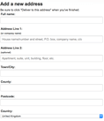
Example: Amazon
Here is an example of the 80/20 rule on Amazon’s checkout process. As shown in the picture, the country in the form is pre-populated with United Kingdom. Since the United Kingdom is the most selected country while browsing from amazon.co.uk, they’ve made it the default selection, therefore saving time during checkout. One less thing to think about and choose has no doubt had a positive effect on their conversion of this page. People do not like completing forms so the less effort required from them, the more likely they are to complete the form and convert.

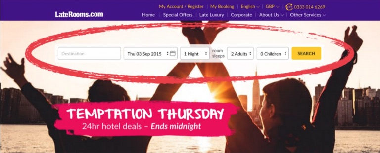
Example: Laterooms
Below is Laterooms old Home page. Through analysing their data analytics and conducting multiple rounds of user testing, they discovered that most people don’t use or even look at most of the content on the page. 98.6% of users didn’t use the menu and 98.9% ignored their prominent popular destinations content.
The vast majority only used Search.
So, Laterooms decided to redesign their home page to focus on the main thing users do when they come to the website: Search. They aimed to remove distraction and clutter, emphasise the search feature, hide ancillary elements and boost credibility. This is a great example of how removing distraction from the page creates a highly focussed user journey and a lovely, clean UI. No colourful banner ads and no gimmicks. Of course they tested the new design with users and following great feedback, split tested the new design against the current version.
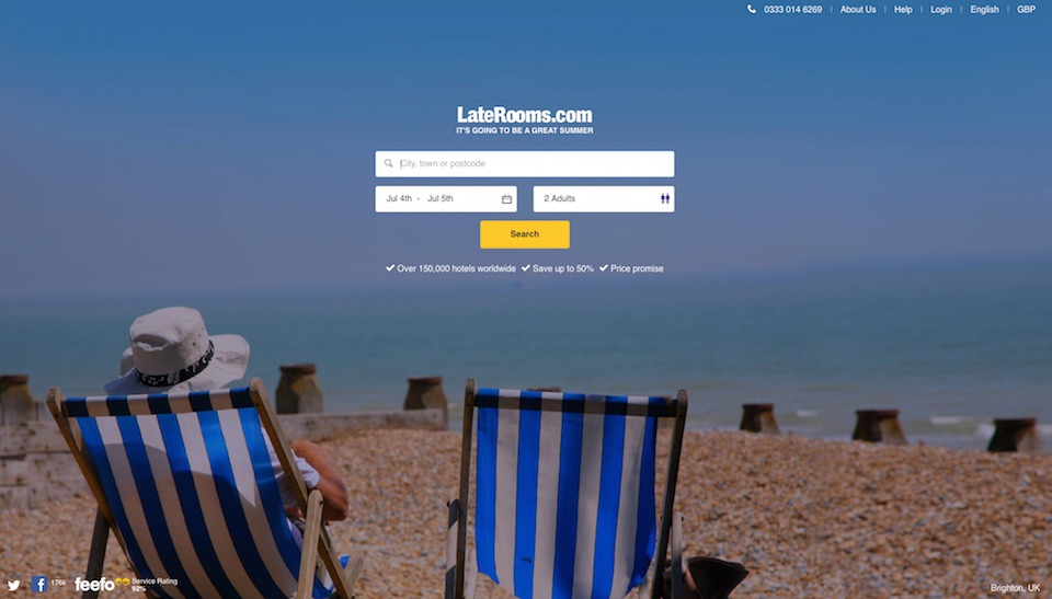
The new, simplified design (shown below) was the clear winner
Mobile first demonstrates Pareto
Luke Wroblewski has made a name for himself advocating a mobile first approach to design and build and it is certainly in line with the 80/20 rule. Luke observed how, most of the time in the design process, the desktop version of a website is the first to be developed and the mobile is often an afterthought. As such, the mobile experience suffers. The mobile first principle states that the design process should be the other way round: mobile should come first. Why?
In designing the mobile version of a website the focus has to be on the 20% of features and functionality that is most crucial for users, simply because there is limited space on small mobile screens. This makes it the most challenging user interface to design for and many companies are still struggling to find talented people and agencies like Keep It Usable that can create outstanding mobile user experiences.
Need help simplifying your user journeys or creating amazing mobile experiences? Arrange a call with one of our super friendly UX experts for complimentary, no-ties advice.
Other posts you may find interesting:
Share this post:
Keep It Usable
UX Research and Design Agency
Floor 3
White Tower
MediaCityUK
Manchester
M50 2NT
United Kingdom
Get directions
Say Hello
+44 (0)161 883 7853
hello@keepitusable.com