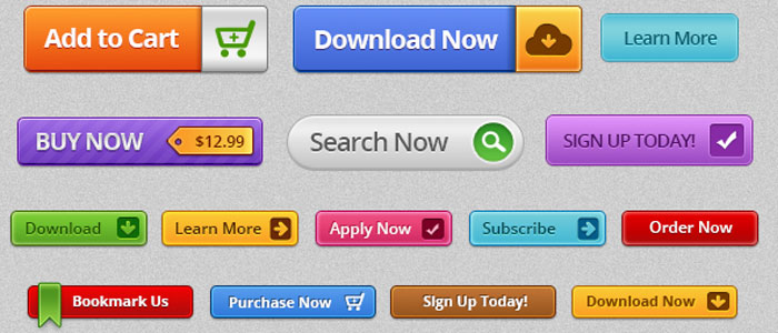
Call to Action Buttons: 5 Psychology tips to increase conversion
What are call to action buttons?
When designing an interface, one of the main goals of the designer, is to ensure that the end user is able to clearly understand what they should do next and where each click will lead them. Call to action buttons are essential to this dynamic, as these buttons are what guide the user through the interface.
The very name of the button, call to action, states there is a necessity for the person engaging with the interface to be stimulated to perform a task. In this case, the designer wants the user to press a button: to make it more enticing so that more visitors will convert. Therefore, your call-to-action buttons should be usable, but they also need to be actively persuasive to encourage more clicks and higher conversion.
Do they really make a difference?
Call to action buttons are the biggest A/B tests run by businesses (they make up around 30% of all tests). The difference between a poor and a great CTA can be anything from a few percent to a few hundred percent and more!
The internet is full of examples of how successful a good CTA can be, so, let’s take a quick look at how we can make these buttons more enticing.
Psychology tips to increase conversion
1 Colour psychology
Colour plays a very important role in determining the pull of your button. The colour you choose can determine who clicks, how many times they click, and how quickly they click.

For example:
– Females tend to prefer the colours purple, green and blue, while men tend to prefer blue green and black
– Blue is a colour considered to build trust while yellow tends to signify a warning.
These signifiers and others should be taken into account when designing CTA buttons to ensure the right audience is drawn to ‘click’. Not only is it important to choose the right colour, but to ensure that the entire page or interface is aesthetically pleasing. Consider the background colour of your template to ensure colours don’t clash and your button isn’t lost in the background.
2 Placement psychology
You want your call to action button to stand out on the page, otherwise it will get lost amongst other elements and suffer from less clicks. If your button has an important message, ensure that it is positioned where it will stand out.
You also want your users to understand what happens when they click on your button. It can be a good idea to introduce your button with accompanying short text to support why the user should click it, what are the benefits for them?

3 Visual psychology
The shape and overall design of the button is where one can get creative, but it is good to keep in mind particular ideas that could add to the ‘clickability’ of the button.
Take into consideration the following:
– People like curves. It has been found that rounded corners draw attention to the inside of the button, whereas square edges draw attention away from the centre. Neuro-aesthetics researchers have found that people prefer rounded shapes and these shapes actually cause more activity in the visual cortex (Bar, M., & Neta, M. (2006). Humans prefer curved visual objects. Psychological Science, 17(8), 645-648).
– Size = Importance. The size of the button should be determined by how important that particular action is to be carried out.
4 Wording psychology
The importance of the message plays a huge part in determining the design of the button. In an increasingly fast paced society, the concept of reading long text becomes less and less appealing. As a result, one wants to ensure that the call to action button is as specific as possible, and gets the message across in the shortest amount of time.
How do we do that?
– Be specific. Consider what you want the user to do and use a command to describe the button. For example, buy, watch, download etc. However, take note that some of the bigger conversions come from using less generic and more specific phrases, such as the one below.


– Keep it simple. Professionalism doesn’t necessarily mean big words and difficult commands. Simple commands make it easy for the user to know what to do and what comes next and allows for a smooth transition through the interface.
– Clarity. If necessary, include a simple message on the button to clarify any ambiguity that may be there from the command. Through simplicity is important, clarity is essential.
– Speak the users language. The larger increases in conversion come from analyzing what your customers really need. In user research we recommend listening to the language they themselves use to explore their mental model and what resonates with them.
– Free is one of the biggest persuaders to motivate action so if your service is free or has a free trial, make it obvious for the user to see.
5 Emotional psychology
It is important to keep in mind the emotions you want your end user to feel while scrolling through your interface. Whether it be a sense of urgency, pity or excitement, you want to give them a reason to click on your button. Think about what calls you to action and why. Why did you buy those shoes on the internet? Was it because they were on a one day sale, or because they were only available online? Our minds are triggered into action by emotions as well as a perceived sense of need to perform an action. With your button, you have the opportunity to develop a sense of need or create a sense of urgency or desire to take your users to the next step.

As humans, we’re pre-programmed to respond to images. They draw us in emotionally. The images you use alongside your CTA can play a huge role in creating the right emotion to engage users and increase uplifts.
Example: Basecamp
Basecamp use several techniques to increase the psychological pull of their CTA.

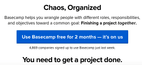
– Concise explanation with benefits, written in the user’s language (note the informality which makes for a friendly tone of voice), ‘Basecamp helps you wrangle people with different roles, responsibilities and objectives toward a common goal: Finishing a project together’.
– Social Proof to further persuade visitors to sign up. Social proof is evidence of other people using the service, in this case, the ‘4,869 companies signed up to use Basecamp just last week’.
– Free. Yes they utilise the power of the word ‘free’ within their CTA.
– Specific wording. Note how they could have just used generic ‘Sign up’ wording but they chose to go with a much more personal feel ‘Use Basecamp free for 2 months – it’s on us’. Did you spot the reciprocity there too? The way they bring out the ‘it’s on us’ makes it feel like they’re doing you a favour, psychologically when someone does something for you, you’re much more likely to reciprocate.
The exciting part!
Now that we’ve taken you through a number of techniques and examples to show how you can increase your conversion using effective CTAs, there’s just one thing left for you to do, and that’s to try a few of these on your own designs.
We’d love to hear how you get on and if you need any advice or have any questions, we’re always happy to help.
Need help or advice?
If you’re curious about any of the above and how ux can help you to create a more successful product, contact our experts for free, friendly, no-ties advice.
Other posts you may find interesting:
Share this post:
Keep It Usable
UX Research and Design Agency
Floor 3
White Tower
MediaCityUK
Manchester
M50 2NT
United Kingdom
Get directions
Say Hello
+44 (0)161 883 7853
hello@keepitusable.com