Some of our clients


Keep It Usable delivered a thorough, considered and innovative solution to the challenges that our user interface presents.
Buhler Sortex
Purpose
- Redesign the existing user interfaces to improve ease of use
- Overhaul the visual design
- Improve usability (efficiency, effectiveness and satisfaction) for all user types
- Decrease training time and costs
- Increase productivity and satisfaction of machine operators
Background
Buhler Sortex is the world leader in innovation and delivery of optical sorting solutions to the global food and non-food processing industries. Each sorting machine includes a touchscreen user interface that enables operators to adjust settings and control the machine. The amount of time needed to train an operator to use a machine takes Buhler 5 days initially, but due to the complicated nature of the current interfaces, this was often followed up by further site visits and telephone support. Buhler saw the importance of an easy to use machine interface in decreasing training and support costs.

Ergonomics and Human Factors
Ergonomics and human factors played a large part in the redesign of the existing screens.
Clothing: Operators often wear gloves whilst using the touchscreen, so larger hit areas and generous spacing between onscreen items was very important.
Environment: Factory lighting is often fluorescent, windows are often positioned high up and this can cause issues with reflections, contrast and dilution of screen colour.
Efficiency: Experienced operators needed shortcuts and larger hit areas to increase speed and decrease human error.
Illiteracy: Many international operators are illiterate so clear use of icons and visual representations of the machine were utilised.
What we did
We worked directly with the management team to understand their goals and requirements. We undertook training to understand how to use the machines ourselves. We also interviewed the trainers who spend time with customers, training them onsite to understand the environments the machines were often used in and which parts of the machine customers needed the most support with.
How we did it (process)
Research
- Stakeholder interviews
- Expert review
- Competitor analysis
- Ergonomic / Anthropometric evaluation
- Environment / Workplace assessment
- Observation of operators using the current machine
Concept phase
A large number of the screens were extremely complicated. The challenge was to simplify the amount of information presented and display it in an intuitive way.
The general operator would spent most of their time on the top level screen, which is used to monitor the equipment.
Alternative concept designs were put together very quickly. Many alternative layouts, flows, logic were explored using:
- Pen and paper sketches
- Rapid prototyping
- Iterative design and testing
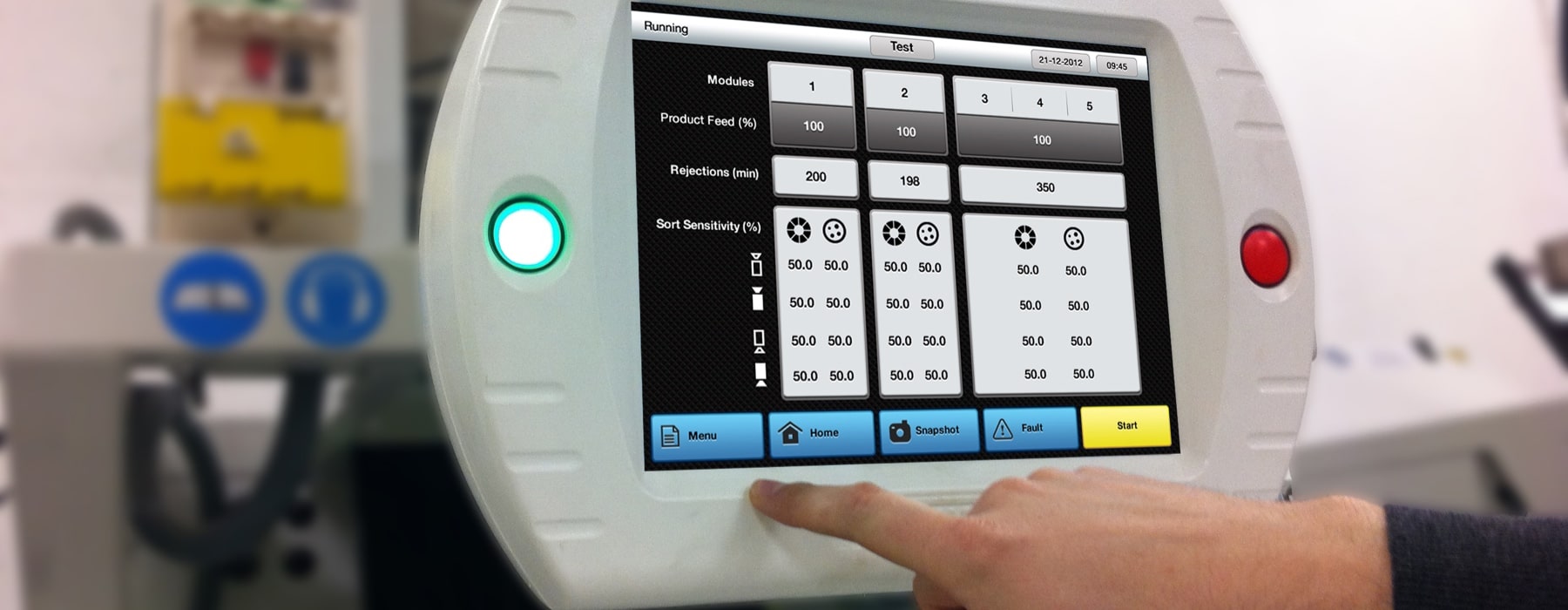
We represented the main working screen as a pictorial concept based on the idea of displaying a more visual representation of the machine configuration, as it is felt this is the most powerful way to easily communicate the data.
Wireframe concept

Concept layout design

Graphic language
Gradients were used to communicate a premium and metallic feel.
Iconography is simple and not too fussy to allow clear and obvious pictorial communication where possible.
Colour and contrast - many colour combinations and intensity levels have been tested in order to create the strongest contrast.
Black was selected to be the most appropriate colour for the background, as it is less fatiguing for the eyes, enhances other colours onscreen and works well in both high and low light environmental conditions.
Testing
The designs were frequently tested on a working hardware prototype of the touch screen. The prototype screen characteristics matched the screen technology that was used in the production machine.
We tested hit areas, layout, colours, light reflections and contrast - as the screen technology dilutes the designs. Screen responsiveness, visual affordance and visual feedback were tested using a basic interactive mockup.
The concepts and visual designs were constantly tweaked to perfection.
Touch screen prototype

Final design
This design will require a lot less learning from the user’s perspective. They can visually see the machine in front of them and the visual representation of it on the interface. The new pictorial representation and the icons should have a dramatic improvement on the user’s efficiency, effectiveness and satisfaction (ISO 9241-11) with the working screen.
It takes less time and effort for the brain to process a visual icon than to read text which is why people prefer to look at pictures, they are also more memorable and it all adds up to a more pleasing experience for the end user.
Main screen before redesign

Main screen after redesign

Keep It Usable
UX Research and Design Agency
Floor 3
White Tower
MediaCityUK
Manchester
M50 2NT
United Kingdom
Get directions
Say Hello
+44 (0)161 883 7853
hello@keepitusable.com