Increase your checkout conversion: 6 tips from real world user tests


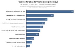
Are you losing too many potential customers at the checkout stage? You’re not alone. According to recent research (Baymard 2016), more than 68% of users abandon an online purchase.
Why is that? Account creation, long and complicated checkout, hidden fees and security issues are popular reasons for abandonment.
Here at Keep It Usable, we’ve been conducting research with users for a long time and we regularly see the same issues, frustrations and concerns when purchasing online.
Below we’re sharing with you the top 6 things you can do that are fundamental for improving your checkout UX and conversion.
Tip 1: Ensure delivery info and costs are visible throughout

When customers have decided to buy something from your website, the next thing they want to know about is delivery. This can be split into two parts:
Delivery information: How long will it take to arrive? Can I get it by this date? Do they deliver to me?
Delivery cost: How much is it going to cost to deliver?
Customers assess the above information alongside the cost of buying the item to determine if it’s worth going ahead with the purchase from your site or if they need to compare the price on other sites. On many websites, delivery information is not easy to find! When it’s not on the product page, often people assume it will be on the basket page. If it’s not there, some continue to checkout to check for the info, others start to look for a delivery information page (often on the footer). It’s then when things start to get messy! They struggle to find the info, they struggle to get back to the item they were looking at and it disrupts the experience resulting in them being more likely to leave.
And some of you are really doing yourselves a disservice as you’re offering free delivery or free next day delivery if you spend a certain amount (which we know converts), but you’re not making this clear enough to users where it matters most – in the basket. Don’t assume that just because you have messaging elsewhere that you don’t need to keep confirming that message along the whole user journey.
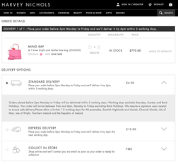
Example: Harvey Nichols
Harvey Nichols clearly display delivery information in the basket, where users expect to see it. All the available options are clearly listed, and as opposed to needing to navigate to another page to see more detailed info (such as on asos.com), each option can be easily clicked to expand more delivery details.

Tip 2: Checkout as a guest is a must-have
(but persuade people to sign up at the end!)
One thing that we constantly observe is that people do not want to be forced to create an account in order to buy from you. Users expect to be able to checkout as a guest, especially for single item purchases.
Users become frustrated and annoyed when they are forced to create an account because
- If this is their first purchase from your site, they don’t know if they’ll buy from you again so for them, it’s not worth the perceived effort of signing up.
- They assume they will be sent marketing emails (in their words ‘spam’) and they don’t want them.
- They believe it is time-consuming. Although often the time that it actually takes to checkout as a guest is pretty much the same as needed for signing up (mostly, the only additional information required to create an account is a password).
So, what can you do? The easiest solution is to persuade them to sign up after they’ve checked out as a guest. Simply present them with a password box to create an account.
You should also remember to tell them why they should sign up. What’s going to motivate them the most? The fact that they can track their order? Get a special discount off their next purchase? Buy future purchases more quickly and easily? If you conduct regular research with your customers you should know what will appeal to them the most, if not, ask them 🙂
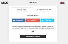
Asos offer the option to ‘Continue to checkout’ or sing up using a social account. This is a clever idea – they know their target audience are active social networkers!

Tip 3: Short and easy checkout process
During user testing we consistently observe that users feel overwhelmed when they get to a page with a lot of fields to fill out.
It boils down to two main issues:
- The number of fields they’re required to complete.
- They feel uncomfortable with the information they’re being asked to give.
We know that you want to know as much about your customers as possible, but this comes at a price – your conversion. The majority of the time, they don’t understand why they have to provide so many details, such as phone number, gender or other personal information just to buy a new pair of shoes or handbag.
Only present required fields and relevant information, in order to avoid giving the impression that the form is longer than it really is.
Your customer doesn’t want to fill out lots of information and they don’t understand why you want to know personal information. When asking for additional information, provide some help text to explain why this is required: for example, we know that people don’t like to leave their phone number, so at the side of the phone number field explain that they will receive text alerts when the order is dispatched. This will reassure people and motivate them to progress through the checkout.
Example from ASOS:
ASOS know their users dislike giving away their mobile number, so they give a clear reason that is focussed on the user benefit ‘delivery updates’.


Tip 4: Provide information in the shopping basket
Giving customers the right information at the right time can minimise confusion, eliminate surprise, increase confidence and motivate them to complete the purchase.
When your users add a product to the basket, show them details about what they are buying, stock availability, delivery options, return policies, security indicators or payment options. Users should have immediate access to all of this key information directly from their shopping basket in order to reduce their anxiety and the frustration of not exactly knowing what to expect.
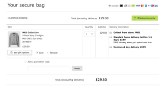
Example: Marks and Spencer

Tip 5: Make navigating your checkout easy and simple
It’s important not to assume that people go through your checkout in a linear manner. In reality, users navigate back and forth to previous steps to double check and edit information.
So, you need to make sure that during your usability testing you do a full test of your checkout navigation – how easy is it to go back to previous steps and edit information? Is it easy to do on mobile or do people skip back too far and lose the information they’ve already entered?
Accordion checkouts and the problem with mobile interaction
32% of checkouts are in the accordion style (Baymard, 2016). This approach is liked because it provides all the checkout steps in individual expanding and collapsing sections, presented on a single page. Having all the checkout steps in one page encourages users to review their information and lessens navigation.
It has also a positive impact on users’ perceived length of the whole checkout process: providing all the steps on one page, makes them feel that the checkout is shorter.
Although this approach is popular, accordion checkouts can cause major problems with mobile users. On desktop, users can simply click into each section of the accordion, however, on mobile users are most likely to use their back button to navigate back to previous sections but this causes them to go back a screen, resulting in them losing all of the information they have just entered and becoming very frustrated! At this point you’re likely to lose them to a competitor who provides a better checkout experience.
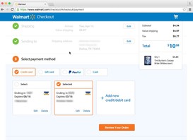
Example: Walmart
Walmart’s accordion provides a summary of each collapsed section with a simple ‘Edit’ button. The summary means users can easily see and double check their information without navigating back into the section.

Tip 6: Use trusted logos and symbols to convert
The average user’s perception of a website’s security is largely determined by their gut feeling, which is to a large extent the consequence of how visually secure the page looks. Basically, it’s all about looks! Authentication/security logos, such as ABTA and ATOL for travel websites or the VISA authentication logo for general e-commerce websites, provide users with the peace of mind that they will be protected. We also observed that users tend to feel safer when they can pay through Paypal because they know that they will be refunded if anything goes wrong.
People will also look out for a lock symbol either on the page or in the address bar – to them that means the page is secure.
ASOS is a well-known brand but nevertheless, they are very careful to reassure users throughout the whole checkout process. They provide a security logo even before users have started to enter their information. The logo is further reinforced by a note which reassures users that their personal data will never be used or posted on their behalf.
Example: Harvey Nichols
Harvey Nichols use the Norton logo and the accepted card logos to increase trust.


Example: Marks and Spencer


Marks and Spencer go a step further by adding the lock symbol to their call-to-action button, and they’ve clearly thought about the persuasiveness of the copy too ‘Checkout securely’.
Need more help?
Learn More About User Testing
Explore Our Usability Testing Service
Need some expert help to increase your conversion? Want to understand your customers better and how they use your website across platforms so you can align your strategy with their needs, increase the effectiveness of your marketing and convert traffic better?
We’ve done so much user testing of websites and checkouts over the years for many brands, we know what works and what doesn’t work to convert traffic into loyal customers. We can also optimise your checkout across platforms – is your mobile experience not converting as well as it should?
Get in touch with us for a chat about your challenges and goals to reveal how we can help you to achieve them.
Share this post:
Keep It Usable
UX Research and Design Agency
Floor 3
White Tower
MediaCityUK
Manchester
M50 2NT
United Kingdom
Get directions
Say Hello
+44 (0)161 883 7853
hello@keepitusable.com