How just one word can change your conversion


Website conversion
Layout, images, colours, fonts are equally important in order to provide users with a pleasant online experience and increase the conversion rate of a website. The design of a website is crucial, but it’s not the only factor that we should take into consideration.
Users should be guided and helped in making a purchase decision on a website; they need to have enough information in order to make an informed decision and the navigation has to flow smoothly. But, is that enough?
Changing just one word can have a huge impact on your conversion rate.
Choosing the right way to say something is fundamental, particularly if the aim is to prompt users to take an action, like buying your products or creating an account.
Choosing the right word(s)
Unfortunately there is no universal answer or solutions.
Since words acquire meanings only when considered in context, knowing which words are better then others, means knowing the context, observing users moving and behaving in that context and constantly putting yourself in their shoes.
It is very important to keep testing, particularly in relation to CTA buttons, as shown in the following case studies.
Understanding your customer’s psychology, behaviour and intention is the secret to effective CTA copy.
Example: ‘Buy now’ vs ‘Shop now’
Dewalt.com have a ‘Buy Now’ CTA button on their product pages. Some of the team thought that changing the wording to something less committal like ‘Shop Now’ might encourage greater click throughs. Others on the team thought the wording change could imply a longer purchase process. So they decided to test both variations to see which resulted in greater conversion.

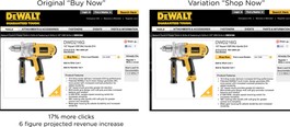
Hypothesis
Current CTA: ‘Buy now’. May imply a faster and shorter process to purchase.
Variation: ‘Shop now’. May imply less commitment and therefore encourage more clicks.
Results
17% more users clicked on ‘Buy Now’ rather than ‘Shop Now’.
The small variation in text had a huge impact on the final result. This represented a six-figure difference in the online sales of the product.
Why?
The next action is clearer with ‘Buy now’, it is very obvious that the user’s intention is to purchase. ‘Shop now’ could be mistaken for continuing to look at more shops, it is less specific regarding the action and more ambiguous.
Example: ‘Find a retailer’ vs ‘Where to Buy’ vs ‘Nearby Retailers’
Hypothesis
Current CTA: ‘Find a retailer’. Concern that this may be mistaken for online retailers only.
Variation 1: ‘Where to buy’. The team felt this version was more direct and may imply less work for the visitor.
Variation 2: ‘Nearby retailer’. Related to a physical and geographical location and therefore may make it clearer that this indicates physical retail stores

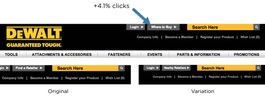
Results
4.1% more users clicked on ‘Nearby retailer’ compared to the two alternatives.
Why?
The button more clearly indicates physical shops where the user can buy the product as it relates to a geographical location, while the others two options could be mistaken as solely relating to online stores.
How 2 Words Lifted Insound’s Checkout Funnel Conversion to 54%
Following the launch of a redesign, Insound found that conversion was underperforming. It was believed that this was due to the length of the checkout process and the vague wording throughout.
Hypothesis
Current CTA: ‘Continue’. Logical description of the button, continues to the next step.
Variation 1: ‘Review order’. Describes what’s going on and reassures that the process is not completed yet, i.e. there’s still time to change your mind.
Variation 2: ‘Submit’. Based on the one-step check out process.
Variation 3: ‘Almost done’. Informs that the process is almost complete.

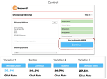
Results
‘Review order’ was the winner with a 39.4% click rate.
Why?
It is explanatory and reassuring at the same time, clearly indicating to the user that they still have time to back out should they need to but also allows them to see an overview of their order and associated information to double check everything before proceeding.
As can be seen, small adjustments to your CTA copy can make a big difference conversion. It’s always worth testing alternatives to see which performs better.
Source of examples: Optimizely
You might also like:
Share this post:
Keep It Usable
UX Research and Design Agency
Floor 3
White Tower
MediaCityUK
Manchester
M50 2NT
United Kingdom
Get directions
Say Hello
+44 (0)161 883 7853
hello@keepitusable.com