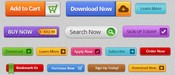
7 Tips to Craft Compelling Call-to-action Copy


There’s no doubt about it, we all know that well-designed call-to-action (CTA) buttons increase conversion. But it’s not just about the visual design of the button. What you say on your CTA (the text) is just as important.
Psychology and persuasion
CTAs guide and prompt users to do something on your website, like searching, signing up or buying a product. It needs to be a clear instruction to your users; it’s there to prompt them to take action.
That’s why your CTA needs to be clear to your users. It has to tell them what they need to do next. However, it also needs to be compelling and persuasive to motivate them to take action. This is where psychology comes into the creation of your CTA. You can’t simply state what will happen when they click the button, it needs to be written for persuasion. Your users need to know why they should click the button.
1. Use a verb
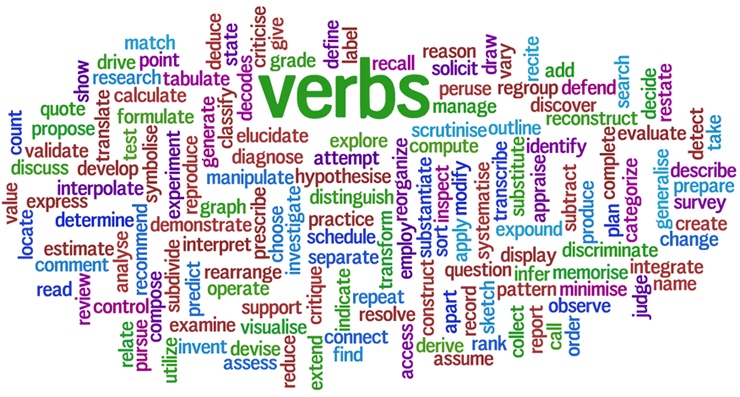
To get people doing what you want them to do on your website, you need to use actionable language. This means verbs! Using a verb helps you tell users how to get from point A to point B, providing directions and guidance. For example, in telling your user “Click here to get started”, you are suggesting what to do and where they are going next. By not including a verb in the CTA copy, you aren’t prompting readers to act, which can negatively impact your click-through rate and conversion.
Barry Feldman of Unbounce recommends starting with an actionable word such as “get”, “learn”, “discover” or “enjoy.” And once you’ve set yourself up to speak to the value of the offer, he recommends following up your action-packed verbs with “the value the clicker shall receive.”
Button copy like “click here” or “download now” doesn’t communicate what you stand to gain by clicking. “Enjoy a free week—on us!” on the other hand, does.
2. Use you or yours
Using you or yours makes users feel like you care about them, and not just about your own business. You want to help them, and make their life easier. It personalises your CTA, and gets your users feeling like you are doing something for them. They feel like you are talking to them.
3. Use me or my
Similar to the previous point, using possessive pronouns makes your users feel as though your product or your service already belongs to them.
4. Show value
Using a short sentence rather than just a word can help users to understand the real value of their action. You can have an entire page explaining the value of your product, but who reads a page in its entirety? No one. Make your call to action as explanatory as possible.
If your call-to-action button doesn’t tell users of the value they will gain by clicking it, they won’t click.

5. Use a negative call to action
Is the aim of your service/product solving someone’s problem? Make it obvious in your CTA. A negative call to action plays on your users’ frustrations with their current situation and makes it clear how you can solve their problem. “
“Worried about your credit rating?” appeals directly to the person’s concerns.
6. Add Free and consider surrounding text
Are you offering a free trial period? Make it obvious that there is no commitment for your users. Netflix example is a good one: their call to action for new users is “Join free for a month” but they clearly specify with a sentence above the button that you can “Watch anywhere, cancel anytime”. Consider the surrounding text.


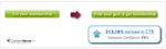
Example: Adding “it’s free” next to the CTA increased conversion by 18%.

7. Incentivise
Using words that provide incentives is a great motivator to click on your CTA. Answer the question “What are your users getting out of this?” and put it on your call to action. They might get a bonus if they purchase immediately or if they invite someone to join the service.
A change in one word can significantly make the difference because words have power, so choose them wisely. Remember to test, test, test your call-to-actions.
Your next read:
How just one word can change your conversion

Call to Action Buttons: 5 Psychology tips to increase conversion

Keep It Usable
UX Research and Design Agency
Floor 3 White Tower,
MediaCityUK,
Manchester M50 2NT
United Kingdom
Get directions
+44 (0)161 818 9586
hello@keepitusable.com